
Table of Contents
Below are five of the many charts the Satori investment team tracks as we manage portfolios. This post may feel a little heavy for some. Rest assured, we are tracking all this so you do not have to. For those who want a look into what we are following, enjoy.
A short summary for those who want to skip the deep dive:
- Year-by-year equity market winners and losers since 2015 show the US has dominated, but other regions and smaller markets swing significantly. Diversifying globally makes sense.
- Are these equity market returns sustainable? Australian share prices look expensive compared to historic averages, which means being selective is the key.
- The US has dominated, but it is also expensive and top-heavy. A handful of mega-cap stocks are dragging valuations up. Earnings need to deliver. Comparing this to Europe and Emerging Markets is where the conversation gets interesting.
- This review is not about triggering mass exits or entries. It is what we look at behind the scenes to take positions on where we are underweight or overweight in particular asset classes (where can we sell high and buy cheap).
- Do not let these insights trigger anxiety. Chart 5 shows long-term context. Short-term returns are messy. Stretch the time horizon and mix your assets. Things get smoother and more reliable.
Chart 1: Sharemarket returns by region over the past 10 years
EM means Emerging Markets. Vol means Volatility.
This table shows the relative performance of various global equity markets over the last 10 years. It also highlights the importance of diversification within a single asset class. The hypothetical ‘portfolio’ in the grey boxes shows the benefit of diversification: lower volatility and potentially higher returns. The portfolio is rebalanced annually and contains each of the equity sectors shown.
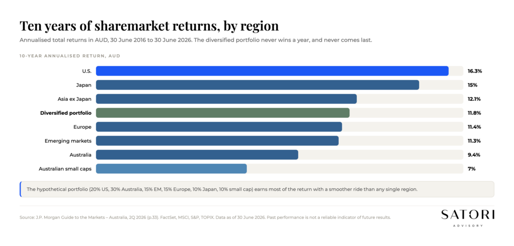
For example, over the past 10 years Small Caps were the most volatile (at 7%) and US shares won the returns race with an AUD 16.3% per annum return.
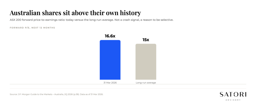
Chart 2: Is the Australian share market ‘good value’?
This helps us work out whether the ASX is a good buying opportunity. While there may still be growth ahead, the Australian market has only been more expensive once in the past 20 years.
Expensive does not mean it must fall. It means the margin of safety is thinner, and being selective about what you own (and at what price) matters more than usual.
Charts 3 and 4: The US is looking expensive, with top-heavy concentration
The pressure is on for US company earnings to live up to the high price tag. The wide range of expectations across sectors highlights how polarised recent years have been for US equities. Current sector valuations sit in different parts of their historical trading ranges.
Where are the alternatives to a top-heavy US?
The value-oriented European banking sector has easily outperformed the Magnificent 7 in 2025.
Weakness in the US dollar since January 2025 has paved the way for stronger returns from emerging markets. The MSCI Emerging Markets index rose 4.2% in June 2025 and has outperformed its large-cap peers by 5 percentage points over 2025. The real bargains are, as usual, in countries that keep investors up at night: Colombia, Turkey, South Africa, Egypt and Brazil. And then there are ‘frontier markets’ like Argentina, Kazakhstan, Vietnam and Romania for the fearless. In the words of Wall Street Journal’s Spencer Jakab, ‘Returns aren’t guaranteed, but an adrenaline rush is.’
Chart 5: Rolling returns by time horizon (1y, 5y, 10y, 20y)
Why staying invested helps manage long-term risk: the bars show the range of returns during each rolling window.
For example, the range of returns over any previous 20-year period (from 1950 to 2025) for global large cap shares (large companies) was from 7% to 17% per annum. Over any single year you could have made 47% or lost 39% in an isolated 12-month period.
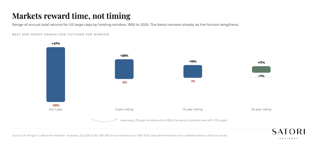
The chart advocates for even a simple diversified portfolio, and for having an appropriate time horizon. The more time you give compounding, the narrower the range of likely outcomes becomes.
What to do with these charts
Use them as inputs, not signals. They show what the data is saying about valuation, concentration and time. They do not tell you to act today. The most useful question after reviewing them is whether your portfolio is built to do its job across the next cycle, not the last one.
If you would like a calm second view on how your portfolio sits against these charts, including the role of each asset class in your plan, we can sense check it in a complimentary initial chat.
Charts and data referenced are sourced from J.P. Morgan and other research providers. These chart figures draw on data through 2025, and we refresh them each quarter.
How Satori Advisory works
At Satori Advisory we energise every part of your financial world. We integrate your tax, business, wealth and lending as a prosperity engine, aligned with what matters most to you. With a clear roadmap, informed by data and backed by decades of strategic experience, we simplify the complex. These charts inform position sizing inside that integration, not stand-alone trades. We do not offer pre-packaged solutions. We deliver tailored, end-to-end advice that reflects your reality and ambitions. You work directly with senior advisers who listen deeply, think boldly and act with purpose, supported by our trusted team and curated network of financial and business specialists, so you can realise your potential, powered by numbers.
Frequently asked questions
Why do you watch 5 charts in particular?
These five cover the most useful angles on a long-term portfolio: regional returns, ASX valuation, US valuation and concentration, alternative homes (Europe/EM), and rolling returns by time horizon. Together they show what the data is saying without forcing a single trade.
Is the Australian share market expensive in 2026?
On a long-term valuation lens, the Australian market has only been more expensive once in the past 20 years. That does not mean it must fall. It means the margin of safety is thinner and selectivity matters more than usual.
Should I buy emerging markets after the US dollar weakness?
EM has had stretches of strong returns when the USD weakens, including in 2025. The decision is not ‘buy EM’ as a trade, it is whether your portfolio’s strategic allocation to EM still fits your goals and risk profile.
Why do longer time horizons reduce return ranges?
Volatility is loud over short periods. Over 10 to 20 years, a diversified portfolio’s range of likely outcomes narrows considerably, because long-run compounding tends to dominate short-run noise.
How do you actually use these charts in client portfolios?
As inputs to position sizing. They help us decide where to be underweight or overweight, not to make wholesale changes. Mass exits and entries are usually expensive. Marginal, evidence-based adjustments inside a long-term plan are usually not.
Ready to talk?
If you would like a calm, no-pressure conversation about how your portfolio reads against these charts, we would be glad to set one up.
Please feel free to get in touch on 1300 925 081 or send an email to [email protected] if you’d like to book in a chat on the above or on other matters.
Disclaimer
This article contains general information only and has been prepared without considering your objectives, financial situation or needs. It is not personal financial advice, taxation advice or legal advice and should not be relied upon when making financial decisions. Before acting on any information, consider its appropriateness to your circumstances and seek professional advice where appropriate.