
Table of Contents
This week I am sharing 10 charts from Franklin Templeton on the market and economic drivers that shape investment returns for all of us. For each, I have tried to explain the takeaway in plain English so you can sense check your own positioning.
Chart 1: Recession risk and why we watch leading indicators
Why this matters. When the economy slows, company profits can shrink, people spend less, and share prices can wobble. The point is not to predict the exact month a downturn arrives. The point is to see whether the direction is shifting and adjust positioning rather than panic later.
Chart 2: Unemployment is the clearest real world signal
Why this matters. Jobs drive spending. Spending drives profits. Profits drive share prices. And weakness in jobs can change the interest rate path quickly. If unemployment starts rising fast, we usually start watching central bank language for any shift toward easing.
Chart 3: House prices versus incomes is an affordability warning light
Why this matters. Affordability drives debt stress, spending behaviour, and financial stability. Comparing house prices to incomes across countries shows where the pressure points are and where the system has slack.
Note on Australia. Because many mortgages here are variable or short fixed, repayment pressure shows up faster than in countries with long fixed loans. That means affordability swings can be sharper, and household budgets feel rate moves more directly.
Chart 4: A ‘global’ share portfolio is often a big US bet by default
Why this matters. Do not get tunnel vision on Australia. Australia is a small part of global equities, and a global index fund can be heavily weighted to the US. For example, the MSCI ACWI factsheet shows a meaningful US dominance.
That concentration shapes your returns, your risks, and your currency exposure. Knowing the regional mix helps us avoid hidden bets, manage home bias, and make deliberate choices about where to diversify.
Chart 5: Concentration risk is real. The top 10 in the S&P 500 are a big slice
Why this matters. Diversification is more important than ever, but the real question is whether you are truly diversified. Recent data puts the S&P 500 top 10 companies at roughly 40% of the index market cap.
This is how investors can think they own ‘the market’ while being far more concentrated than they realise. And on Nvidia: it has been so large that it starts to sound unreal. Sources tracking market cap place Nvidia in the high-US$4 trillion range by mid-2026, the largest company in the world. The exact number moves daily, but the order of magnitude tells you why a single name now meaningfully shapes ‘the index’.
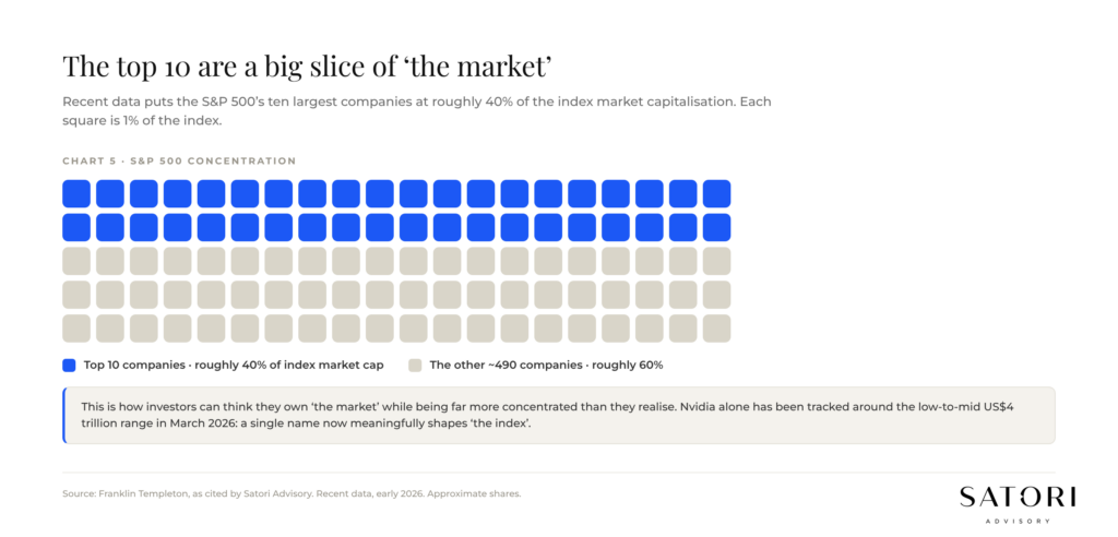
Chart 6: A hot headline is not always a durable trend
Why this matters. Price can move faster than reality. When markets run hot, we care about earnings breadth, reasonable valuations, and supportive policy, not just the chart going up. This is often where late-cycle investors get caught extrapolating short-term momentum.
Chart 7: Over five years, some countries beat the US. That surprises people
Why this matters. People assume the US always wins. It often wins, but not always, and not in every five-year window. When other countries outperform, it is usually because of where they started, cheaper valuations, sector mix, or currency.
The practical lesson is simple. Be careful chasing last year’s winners. Outperformance is cyclical, and mean reversion is a real force.
Chart 8: Leadership rotation is constant, and it is the reason global diversification works
Why this matters. We avoid being too country-centric because a country bet is really a bundle of risks: sector mix, policy settings, and currency. Leadership rotates, and chasing it usually means buying high.
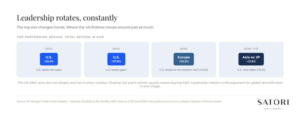
If you have a chart showing dozens of countries appearing in the top slots over long periods, that is not trivia. That is the argument for diversification in one image.
Chart 9: Bubbles are when price outruns reality. AI is different, but still needs discipline
Why this matters. Bubbles happen when price runs far ahead of cash flow, leverage increases, and the story gets cleaner than reality. The AI cycle is different in one key way. Many of the leaders are profitable, cash-generative businesses. That does not mean valuations cannot stretch. It means discipline still applies, even in a real cycle.
Chart 10: Commodities are early signals for inflation, profits, and the Australian dollar
Why this matters. Commodities move inflation, profits, the Australian dollar, and parts of the ASX. They are not just a ‘trade’, they are a signal. Precious metals demand picked up strongly in 2025.
In portfolios, a small allocation can diversify and hedge inflation risk, but sizing matters. Commodities are risk control for many investors, not a full substitute for growth assets.
What to do next
If you take one thing from these ten charts, take this. Most investing mistakes happen when people overreact to one-year outcomes and underprepare for the big drivers that repeat over decades.
If you want a practical step, pick two or three charts and ask what they imply for your own plan. Where are you concentrated without realising. What risks are you exposed to if growth slows. How reliant are you on the US continuing to lead.
If anything here raises questions, reach out. We are here for anything you need.
How Satori Advisory works
At Satori Advisory we energise every part of your financial world. We integrate your tax, business, wealth and lending as a prosperity engine, aligned with what matters most to you. With a clear roadmap, informed by data and backed by decades of strategic experience, we simplify the complex. We do not offer pre-packaged solutions. We deliver tailored, end-to-end advice that reflects your reality and ambitions. You work directly with senior advisers who listen deeply, think boldly and act with purpose, supported by our trusted team and curated network of financial and business specialists, so you can realise your potential, powered by numbers.
Frequently asked questions
How much of a ‘global’ equity portfolio is actually US?
A meaningful majority. Indices like MSCI ACWI are heavily weighted to the US. A global index fund can be 60%+ US exposure by default. Worth knowing before describing your portfolio as ‘diversified’.
How concentrated is the S&P 500 right now?
Recent data puts the top 10 companies at roughly 40% of the index market cap. That is a more concentrated structure than long-term historical averages.
Is the AI cycle a bubble?
It looks different from classical bubbles in one key way: many leaders are profitable and cash-generative. That does not remove the need for discipline on valuations and sizing.
Why do unemployment numbers matter for my portfolio?
Jobs drive spending, spending drives profits, profits drive share prices. Unemployment trends also influence central bank decisions on interest rates.
Why is Australian housing affordability different from other countries?
Most Australian mortgages are variable or short-fixed, so rate changes flow through to household budgets faster than in countries with long fixed-rate loans (like the US).
Is country diversification still worth it if the US keeps winning?
Yes. Over five-year windows other countries do beat the US, leadership rotates, and chasing last year’s winner usually means buying high. Mean reversion is a real force.
What role do commodities play in a portfolio?
Inflation hedge and diversifier. Sizing matters: a small allocation can be useful as risk control, but commodities are not a full substitute for growth assets.
Ready to talk?
If you would like a calm, no-pressure conversation about how the global market drivers fit your wealth plan, we would be glad to set one up.
Please feel free to get in touch on 1300 925 081 or send an email to [email protected] if you’d like to book in a chat on the above or on other matters.
Disclaimer
This article contains general information only and has been prepared without considering your objectives, financial situation or needs. It is not personal financial advice, taxation advice or legal advice and should not be relied upon when making financial decisions. Before acting on any information, consider its appropriateness to your circumstances and seek professional advice where appropriate.