
Table of Contents
Most investment commentary tells a story about a single chart. The chart we are looking at on a given week is rarely the one we are deciding on. We keep nine charts on the dashboard. None of them are forecasts. Each one is a way of reading the environment so the next decision is a calmer one.
This piece walks through the nine, why each one is on the list, and how it shows up in client conversations at Satori Advisory.
Chart 1: Australian property and the auction clearance rate
The first chart is Australian property. Headlines focus on a single weekly figure. We focus on a leading indicator. The auction clearance rate tends to lead house price changes by roughly six months. A short-term downward trend in price can sit alongside a rising clearance rate, which often signals a turn before the price index catches up.
Used well, this chart stops two mistakes. First, calling the cycle off a single month of price data. Second, ignoring a quiet shift in clearance rates because the price chart still looks weak.
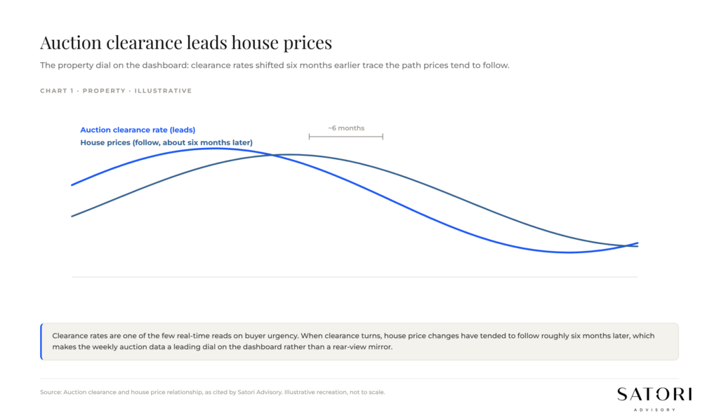
Chart 2: Intra-year drawdowns versus full-year equity returns
The second chart plots annual equity returns as grey bars and the largest intra-year decline as a red dot. The pattern is consistent. Most years deliver a noticeable drawdown inside the year. Most years still finish positive.
What this teaches the dashboard reader is simple. A correction in March is not the year. The market is capable of recovering from intra-year drops and finishing the year in positive territory. The behaviour that matters is staying invested through the dot, not fleeing on the day the dot is being drawn.
Chart 3: Inflation by component, with the RBA reaction function on top
The third chart breaks inflation into its main components: core goods (clothing, household goods, electronics, healthcare), energy and fuel, and services. Core goods and energy can come off sharply from a peak even as services inflation stays stickier. The headline number alone hides this.
The reaction function sits on top. If inflation is moving back into the RBA’s 2 to 3 per cent target band, but services are still elevated, the RBA can stay hawkish for longer than the headline suggests. Through 2026 that is exactly what has played out: with headline inflation around 4.2 per cent and the trimmed mean near 3.4 per cent, both still above the band, the RBA has been lifting the cash rate rather than cutting it, to 4.35 per cent. The dance is between reducing inflation and not killing the economy. Reading this chart well prevents the common trap of assuming a rate cut is imminent just because the front page says inflation is falling.
Chart 4: Tariffs and political pricing
The fourth chart looks at tariffs and how markets are pricing political outcomes. Markets often price a softer real-world stance than a campaign trail position. When tariff risk is being talked up, the question is whether equities and currencies are pricing the worst case or the more likely path.
This chart is less about prediction and more about the gap. Where the gap between rhetoric and pricing is wide, position size matters more than directional bets.
Chart 5: Asset-class diversification, the hypothetical grey portfolio
The fifth chart sits each equity sector against a hypothetical ‘grey portfolio’ that holds them all and rebalances annually. The grey portfolio is rarely the best sector in a given year. It is rarely the worst either. Across cycles, it shows the benefit of diversification within an asset class: lower volatility and potentially higher long-run returns than concentrated sector bets.
This chart is the answer to a recurring client question: ‘Why aren’t we just in the sector that did best last year?’. Because last year is not a portfolio strategy.
Chart 6: Global valuations versus long-run averages
The sixth chart compares current valuations across major equity markets to their long-run average. Cheap or expensive is a relative question, and this chart is one of the cleanest ways to ask it. As long as earnings keep going up, expensive markets can stay resilient. If earnings disappoint, a correction follows.
Important nuance from JP Morgan’s index work: be careful making broad assumptions about the US market when the top stocks are operating very differently from the rest. The S&P 500 reads as one number; underneath it sits two very different cohorts.
Chart 7: US index concentration and the Magnificent 7
The seventh chart makes that nuance concrete. To put the outperformance of the Magnificent 7 in perspective, the S&P 500 as a whole returned 24.2 per cent in 2023. The Magnificent 7 as a group returned 75.7 per cent. The gap was less extreme in 2024 and 2025 than that 2023 peak, but a small group of US mega-caps kept driving a large share of index returns. That is the kind of dispersion that quietly raises concentration risk in any portfolio that is benchmarked to the index.
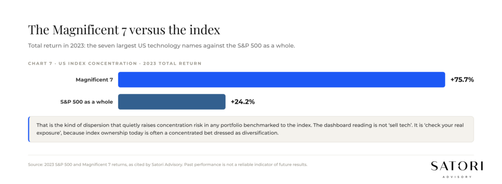
History is not without precedent. A small number of companies have accounted for a large share of the US stock market before. The dashboard reading is not ‘sell tech’. It is ‘check your real exposure’, because index ownership today is often a concentrated bet dressed as diversification.
Chart 8: Australian home bias
The eighth chart is the Australian home bias chart. Australia makes up under 2 per cent of the world’s share market. Many Australian investors hold 10x to 30x that exposure in their portfolios, often via direct shares and via super. The reasons are familiar: dividend yields and franking credits.
Two practical consequences. First, if dividend yields or franking credits change, an Australian-heavy portfolio without a strong capital growth plan is exposed. Second, the rest of the world’s earnings power, much of which is structurally different from the ASX, is sitting outside the portfolio. The dashboard prompts the question, not the answer: is your home bias intentional or inherited?
Chart 9: Australian sector earnings and forward valuations
The ninth chart shows two things side by side. On the left, consensus expectations for earnings in the Australian equity market for the next calendar year and how markets are expected to fare. On the right, the forward price-to-earnings multiple by sector, plotted against the sector’s long-run average.
Sectors trading above their long-run forward P/E are not automatically a sell, and sectors below are not automatically a buy. But the relative picture is one of the best single-screen reads of where the market is hot and where it is quietly cheap. We use it to challenge a portfolio’s sector tilt, not to time the next quarter.
How to read the dashboard, not just the charts
Nine charts read together are far more useful than any one of them read alone. The property chart can suggest a turn that the equity volatility chart says not to react to. The valuation chart and the concentration chart together explain why two portfolios with the ‘same’ index exposure can produce very different results. The home-bias chart and the global valuations chart together reframe what an Australian portfolio should actually look like.
None of this replaces a plan. A plan answers: what are we trying to achieve, by when, with what level of risk, and how is that taxed and structured? The dashboard answers a smaller, daily question: given the plan, what is the environment doing this quarter and what does that change about the next decision?
How Satori Advisory works
At Satori Advisory we energise every part of your financial world. We integrate your tax, business, wealth and lending as a prosperity engine, aligned with what matters most to you. With a clear roadmap, informed by data and backed by decades of strategic experience, we simplify the complex. We do not offer pre-packaged solutions. We deliver tailored, end-to-end advice that reflects your reality and ambitions. You work directly with senior advisers who listen deeply, think boldly and act with purpose, supported by our trusted team and curated network of financial and business specialists, so you can realise your potential, powered by numbers.
Frequently asked questions
Why nine charts and not three?
Because investment decisions sit at the intersection of several different forces: cycle, inflation, valuation, concentration and behaviour. Three charts can tell a single story very well, but they can also make a portfolio over-react. Nine charts force a triangulation across property, equities, inflation and global exposure before any single chart drives a move.
Is the auction clearance rate really a leading indicator for house prices?
Historically it has tended to lead price changes by roughly six months in Australian capital cities. It is not a guarantee. It is one of the cleaner real-time signals of buyer demand, which is why it sits on the dashboard rather than waiting for the next monthly price index.
How worried should I be about Magnificent 7 concentration in my portfolio?
Worried enough to know your real exposure. If you hold a global equity index, a meaningful share of your weight is in a small number of US mega-caps that are behaving very differently to the remaining 493 stocks. That is not automatically bad. It is something to size, not ignore.
Should an Australian investor have less Australian exposure?
Not necessarily less, but more intentional. Many Australian portfolios are 10x to 30x more Australian than world index weights would suggest, often without an explicit decision behind it. The right home bias is the one you have chosen on purpose for tax, income and behavioural reasons, not the one you inherited.
Ready to talk?
If you would like to see the live version of this dashboard, applied to your own portfolio, we would be glad to set up a calm, no-pressure conversation.
Please feel free to get in touch on 1300 925 081 or send an email to [email protected] if you’d like to book in a chat on the above or on other matters.
Disclaimer
This article contains general information only and has been prepared without considering your objectives, financial situation or needs. It is not personal financial advice, taxation advice or legal advice and should not be relied upon when making financial decisions. Before acting on any information, consider its appropriateness to your circumstances and seek professional advice where appropriate.